Menu Class Diagram
1. Menu Class Diagram
Averos defines its menu as a set of ApplicationNavigationItem.
menu: ApplicationNavigationItem[]
Below is the class diagram related to a navigation item:
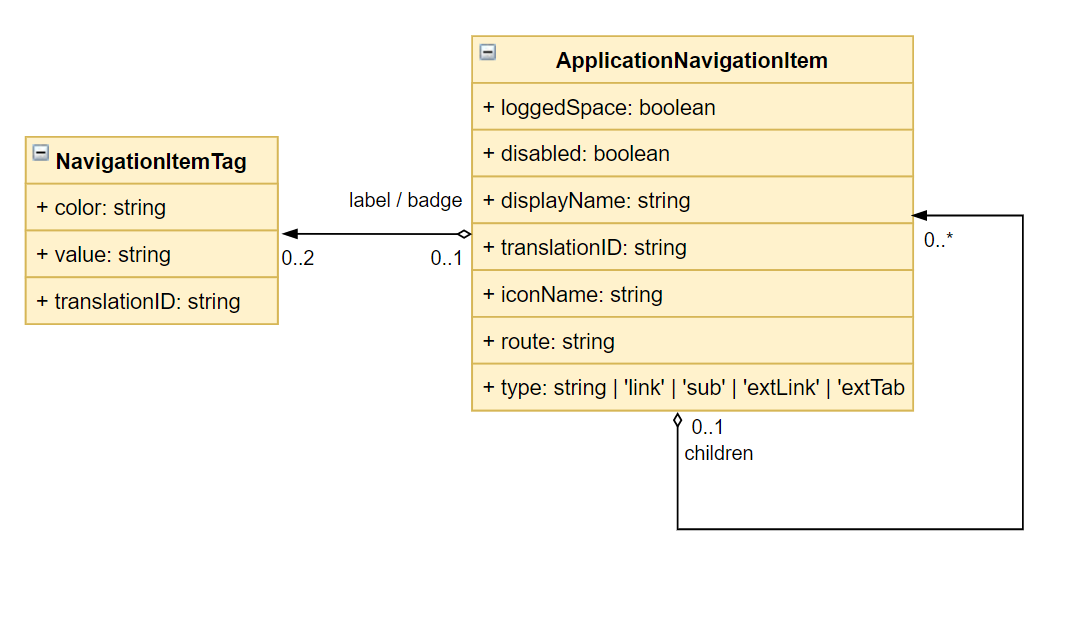
2. Attributes Description
loggedSpace: Optional field, by default false. Defines whether the action is only available and visible to logged user (if true) or to the public/none logged users (not set or if false)- disabled: if true the menu item will be rendered for the user but remains disabled.
- displayName: the menu name to be displayed. (This name is translated for other languages than English)
- translationID: an optional paraleter targeting the translation identifier related to the item display. This translationID is configured in the translation json file as well.
- iconName: Optional filed. Defines the icon to be displayed on the item
- route: defines the route that should be triggered when clicking the menu item. Could be:
- An angular regular route (“/users/search”)
- A full URL (https://www.google.com)
type: ‘link’ / ‘sub’ / ‘extLink’ / ‘extTabLink’: defines the type of the link:- link: a regular angular routerlink defined in the key “route”
- sub: a root menu item. Sub items are defined in the key “children”
- extLink: open the item route link in the current tab. Redirection to the target link is triggered in the same tab.(i.e. https://www.google.com)
- extTabLink: open the route url link in an external tab (i.e. https://www.google.com)
- label: NavigationItemTag :
- color: the label Background Color
- value: the label string value to be displayed
- translationID: an optional paraleter targeting the translation identifier related to the item display. This translationID is configured in the translation json file as well.

badge: NavigationItemTag:- color: the badge Background Color
- value: the badge string value to be displayed
- translationID: an optional paraleter targeting the translation identifier related to the item display. This translationID is configured in the translation json file as well.
children: a set of ApplicationNavigationItem
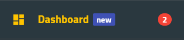
3. Attributes UI Mapping
i. Menu Item Customization Mapping
a. UI Mapping
Below the different menu attributes mapping with respect to the menu UI view layout:
b. Target JSON Structure
The resulting sideMenu json object will look like the object below:
(Json sideMenu example)
"sideMenu": [
  {
    "displayName": "Dashboard (default menu)",
    "translationID": "menu.dashboard",
    "iconName": "dashboard",
    "loggedSpace": "true",
    "type": "link",
    "label": {
      "color": "indigo-500",
      "value": "new",
      "translationID": "menu.dashboard.label"
    },
    "badge": {
      "color": "red-500",
      "value": "2",
      "translationID": "menu.dashboard.badge"
    },
    "route": "dashboard",
    "disabled": "false"
  },
  {
    "displayName": "Referential",
    "translationID": "menu.referential",
    "iconName": "domain",
    "loggedSpace": "true",
    "type": "sub",
    "disabled": "false",
    "children": [
      {
        "displayName": "Users",
        "translationID": "menu.users",
        "iconName": "supervisor_account",
        "loggedSpace": "true",
        "type": "sub",
        "disabled": "false",
        "children": [
          {
            "displayName": "Search Users",
            "translationID": "menu.users.search",
            "iconName": "local_library",
            "type": "link",
            "route": "/users/search"
          },
          {
            "loggedSpace": "true",
            "displayName": "Add User",
            "translationID": "menu.users.add",
            "iconName": "person_add",
            "type": "link",
            "route": "/users/create",
            "disabled": "false"
          }
        ]
      }
    ]
  }
]
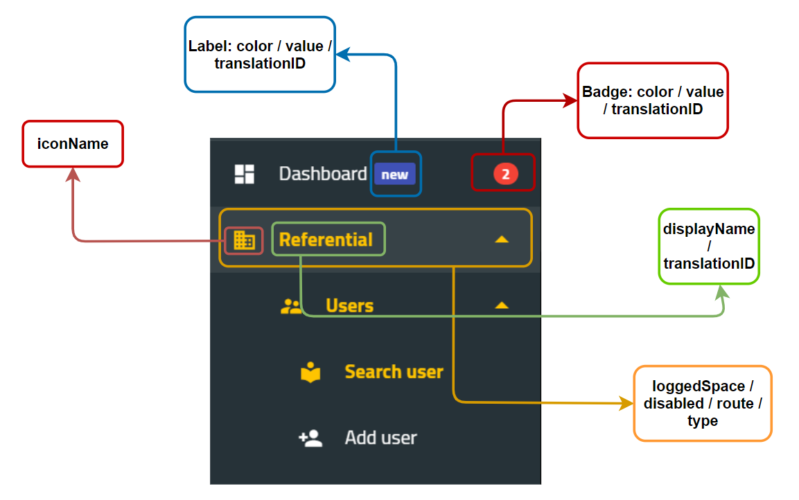
ii. Label and Badge Customization
a. UI Mapping
Labels and badges can be customized within the application menu either by setting their values or by changing their colors.
Below are labels and badges menu attributes mapping with respect to the menu UI view layout:
b. Target JSON Structure
The resulting json object structure will look like the object below:
"label": {
      "color": "indigo-500",
      "value": "new",
      "translationID": "menu.dashboard.label"
    },
    "badge": {
      "color": "red-500",
      "value": "2",
      "translationID": "menu.dashboard.badge"
    }
c. Color Panel
The badge component color is defined using "color": "red-500", which is a reference to the material color red having the variant 500.
Below the list of the supported colors. For further details please checkout the angular material color reference.
| Color | Variant |
|---|---|
| red | 50 -> 900 / A100 -> A700 |
| pink | 50 -> 900 / A100 -> A700 |
| purple | 50 -> 900 / A100 -> A700 |
| deep-purple | 50 -> 900 / A100 -> A700 |
| indigo | 50 -> 900 / A100 -> A700 |
| blue | 50 -> 900 / A100 -> A700 |
| light-blue | 50 -> 900 / A100 -> A700 |
| cyan | 50 -> 900 / A100 -> A700 |
| teal | 50 -> 900 / A100 -> A700 |
| green | 50 -> 900 / A100 -> A700 |
| light-green | 50 -> 900 / A100 -> A700 |
| lime | 50 -> 900 / A100 -> A700 |
| yellow | 50 -> 900 / A100 -> A700 |
| amber | 50 -> 900 / A100 -> A700 |
| orange | 50 -> 900 / A100 -> A700 |
| deep-orange | 50 -> 900 / A100 -> A700 |
| brown | 50 -> 900 |
| gray | 50 -> 900 |
| blue-gray | 50 -> 900 |